Elementor
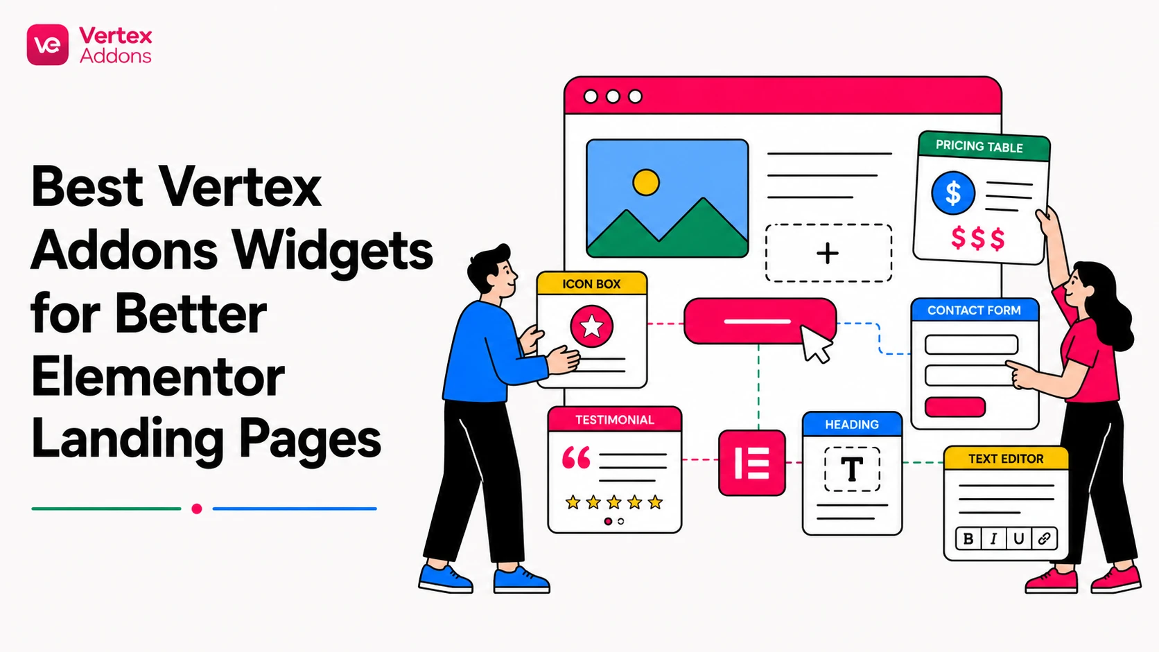
Best Vertex Addons Widgets for Better Elementor Landing Pages
Discover practical Vertex Addons widgets for improving Elementor landing pages, including CTAs, feature cards, pricing sections, forms, maps, tables, testimonials, and interactive content.
A good landing page is not just a collection of nice sections. It has to guide visitors from interest to action. That means every widget on the page needs a job. Some widgets explain value. Some build trust. Some reduce friction. Some move the visitor toward the next step.
Vertex Addons gives Elementor users a broader set of widgets for building these sections inside the Elementor editor. The goal is not to use every widget on one page. The goal is to choose the right widget for the right moment in the page journey.
This article highlights practical Vertex Addons widgets and widget groups that can improve landing pages when they are used with clear intent.
Start with the landing page journey
Before choosing widgets, map the page. A typical landing page has five jobs:
- Capture attention
- Explain the offer
- Show benefits or features
- Build trust
- Ask for action
Each widget should support one of these jobs. If a widget does not make the page clearer, more persuasive, or easier to use, it probably does not belong on that page.
Creative Button for stronger calls to action
The CTA button is one of the most important elements on a landing page. A weak CTA can make a strong offer feel flat. The Creative Button widget is useful when the main action needs more visual emphasis than a standard button.
Use it for actions such as:
- Get Started
- View Pricing
- Book a Demo
- Download Now
- Contact Us
The official documentation explains that the widget supports multiple button style presets, text, links, optional icons, icon positioning, spacing, and style customization. That makes it useful for landing pages where the CTA needs to match the brand and still stand out.
Use this widget sparingly. One strong animated or styled button in the hero section can help. Five competing animated buttons can distract visitors.
Information Box for benefit sections
Most landing pages need a section that explains why the offer matters. This is where Information Box-style cards are useful.
A benefit card usually needs three parts:
- a visual cue or icon
- a short heading
- one clear explanation
This format works well for service benefits, product highlights, feature summaries, agency capabilities, or onboarding steps. It also makes scanning easier. Many visitors will not read every paragraph, but they will scan short cards.
Keep each Information Box concise. Avoid writing a full paragraph inside every card. The goal is to make the page easier to understand, not to hide a long article inside a grid.
Price Box for offers, plans, and packages
If the landing page needs to present plans, packages, or offer tiers, a Price Box can help organize the decision. A pricing section should not only show a number. It should explain what the visitor gets and which option fits their situation.
Use a pricing widget when visitors need to compare:
- service packages
- product plans
- membership levels
- digital product tiers
- one-time vs recurring offers
Avoid using pricing boxes when there is only one simple CTA. In that case, a focused section with one button may convert better than a pricing-style layout.
Form Builder for lead capture
A landing page often needs a form. That could be a contact form, quote request, demo request, registration form, or simple inquiry form.
The Form Builder widget belongs near the point where the visitor is ready to act. Do not place a long form too early unless the page goal is immediate lead capture and the offer is already clear.
For most landing pages, keep the form short. Ask only for the fields needed to continue the conversation. Long forms can create friction, especially on mobile.
Good form placement options include:
- after the offer is explained
- after a pricing section
- after testimonials or trust proof
- in the final CTA area
Put the workflow into practice
Build faster Elementor pages with Vertex
Explore the live demos when you want to see Vertex widgets in context, then compare plans when you are ready to choose access for your sites.
Testimonial Carousel for social proof
Landing pages need proof. A Testimonial Carousel can help when you have multiple short testimonials and want to show them without making the page too long.
The key is quality. A carousel full of vague praise is not useful. Strong testimonials mention a problem, result, experience, or specific benefit.
Use testimonial sections after the visitor understands the offer. If you place testimonials before the visitor knows what the page is about, the proof has less context.
Team Member Carousel for service and agency pages
When a landing page sells expertise, people matter. The Team Member Carousel can help agencies, studios, consultants, and service providers show the human side of the offer.
Use this when trust depends on who will deliver the work. For example, an agency page can show designers, developers, strategists, or support members. Keep bios short and relevant to the visitor’s decision.
Countdown for campaign urgency
The Countdown widget can be useful for time-sensitive campaigns, launches, webinars, seasonal discounts, or limited enrollment periods.
Use countdowns carefully. Urgency works only when it is real. Fake scarcity can damage trust. A countdown should support a genuine deadline, not pressure visitors without reason.
Good uses include:
- event registration deadline
- product launch date
- limited campaign period
- early-bird pricing window
Advanced DataTable for structured comparisons
Some landing pages need structured information. Advanced DataTable can help when visitors need to compare specs, features, packages, schedules, or details.
This is especially useful for technical products, services with multiple deliverables, event schedules, or feature comparison sections.
Use tables only when structure improves understanding. Do not use a table for content that would be easier to read as cards or short paragraphs.
Advanced Map for location-based landing pages
For local businesses, real estate, events, clinics, stores, and service-area pages, location can be a conversion factor. Advanced Map can help visitors understand where something is located or where a service is available.
A map section works best when the location matters to the decision. If the page is fully digital and location is not relevant, skip it.
Accordion, Tabs, and Toggle for compact explanations
Landing pages often need extra explanation, but too much visible text can make the page feel heavy. Accordion, Tabs, and Toggle widgets can help organize secondary information.
Use these widgets for:
- FAQs
- feature details
- process steps
- plan details
- technical notes
- objections and answers
Do not hide essential conversion information. If visitors must know something before acting, keep it visible. Use collapsible content for supporting details, not the core offer.
Slides for visual storytelling
The Slides widget can help when the offer needs a more visual introduction. It can be useful for product highlights, campaign headers, hero variations, portfolios, or multi-step messaging.
Use slides only when each slide adds value. If the first slide says everything important, a static hero may be stronger.
News Ticker for updates and announcements
News Ticker can work on landing pages that need to show recent updates, alerts, releases, event messages, or limited announcements.
It should not distract from the main CTA. Use it for timely information, not for decoration.
How to choose the right widget mix
For a simple service landing page, start with Creative Button, Information Box, Testimonial Carousel, Accordion for FAQs, and Form Builder.
For a product or pricing page, consider Creative Button, Price Box, Advanced DataTable, Accordion, and Form Builder.
For an event or campaign page, consider Countdown, Creative Button, Slides, Form Builder, and Map if location matters.
For a content-heavy landing page, use Tabs, Accordion, Toggle, and Information Box to make the page easier to scan.
Common mistakes to avoid
Do not use widgets only because they look impressive. A landing page should guide action.
Do not use too many motion effects in the same view. Animation should guide attention, not compete for it.
Do not hide important information inside accordions. Use collapsible sections for secondary details.
Do not add maps, tables, or carousels unless they solve a real page problem.
Do not forget mobile. Test every button, form, carousel, and collapsible section on smaller screens.
FAQs
What are the best Vertex Addons widgets for a landing page?
A strong starter mix is Creative Button, Information Box, Price Box, Form Builder, Testimonial Carousel, and Accordion. The best choice depends on the page goal.
Should every landing page use a pricing section?
No. Use a pricing section only when visitors need to compare plans, packages, or offer tiers. For a single offer, one clear CTA may be better.
Can I use carousels on landing pages?
Yes, but use them carefully. Carousels are best for testimonials, team members, or visual highlights where multiple items need to fit into limited space.
Are accordions good for SEO?
Accordions can be useful for FAQs and supporting information, but they should not hide the main message of the page. Keep essential content visible.
Which widget should I test first?
Start with a CTA widget and a benefit-card section. Creative Button and Information Box are practical first choices for many landing pages.
Next step
Build your next landing page with a clear goal first, then choose Vertex Addons widgets that support that journey. A focused widget mix usually performs better than a page overloaded with effects.
Next step
Choose the plan that fits your Elementor workflow
Review site limits, yearly or lifetime access, and the secure Webilia checkout path before purchasing.
Compare Vertex pricing